Bitcoin price is at roughly $37,000, gaining more than $10,000 over the last month. The BTCUSD chart is beginning to look a lot more bullish. However, the most chart you’ll ever see is the top cryptocurrency by market cap compared against the money supply. Take a look.
Bears claim Bitcoin is going back to $10,000 due to the negative macro environment. More yet are sidelined, waiting for closer to the recurring “halving” before they expect BTC to appreciate further. But it is possible that bull market is brewing, and the aforementioned market participants are in disbelief and suffering from recency bias.
Even more bullish than the standard BTCUSD chart, is BTCUSD versus the M1 money supply. In fact, it could potentially suggest that Bitcoin is about to embark on its most significant bull run since 2017.
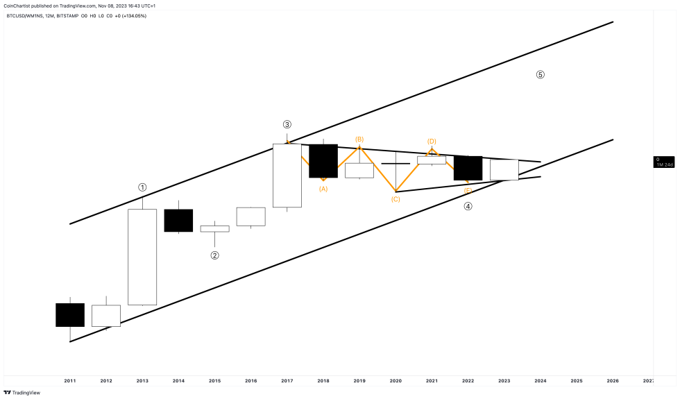
BTC versus M1 Money Supply | BTCUSD on TradingView.com
The chart above depicts a long-term primary uptrend channel beginning in 2011. Unlike the normal Bitcoin chart against the US dollar, this ratio never made a new high after 2017. Against the whole supply of money (including currency, demand deposits, and other liquid deposits), the top cryptocurrency has been in a six-year bear market. Importantly, from a technical perspective, is the fact that the price action is contained within a contracting triangle.
According to Elliott Wave Principle, primary trends move in five waves up. Odd numbers waves move in the primary trend direction, while odd numbered waves correct the trend. Triangles waves typically appear in the wave 4 position, or wave B during a corrective phase. Triangles themselves must be counted with five waves, labeled ABCDE. The chart above shows that same exact back and forth trading sequence, potentially leading to a thrust above the upper trend line of the pattern.
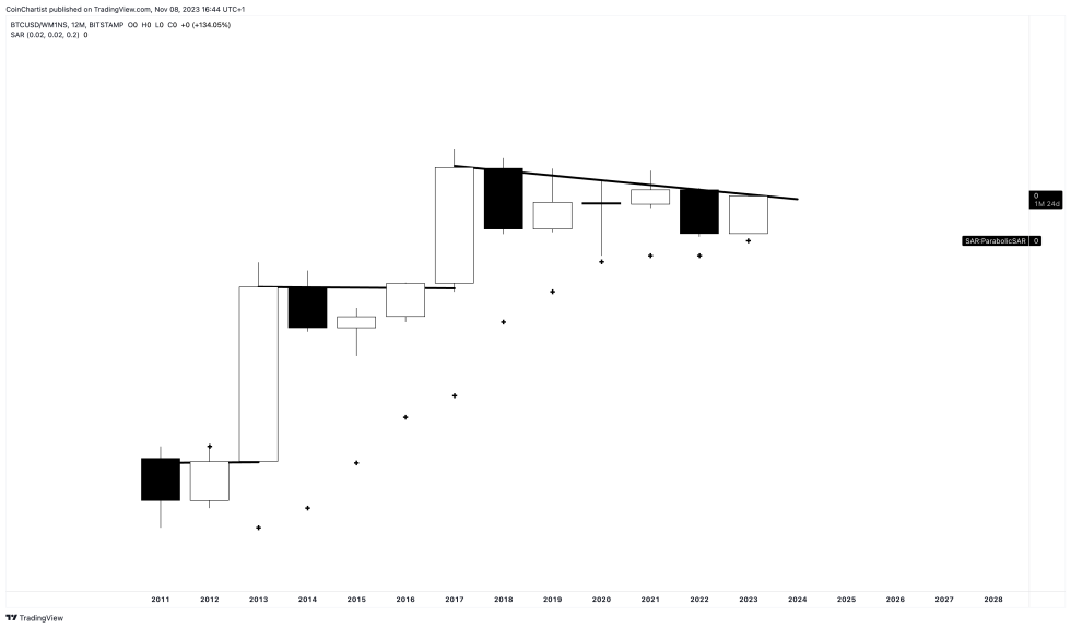
Parabolic SAR is supporting the uptrend | BTCUSD on TradingView.com
With the channel and wave counts removed, a breakout from a downtrend line appears imminent on the 12M Bitcoin versus M1 money supply chart. This isn’t just any Bitcoin chart, but the highest timeframe possible. In technical analysis, higher timeframes always have the most significance. If the king of cryptocurrencies can make a higher high above 2017, the value of BTC compared to the supply of money could skyrocket.
The Parabolic SAR also suggests that the ratio is still in a long-term uptrend, with price action failing to tag the SAR during Black Thursday and the most recent bear market in BTCUSD. And if the USD pair has already made two all-time highs without a true breakout against the money supply, what happens to the standard BTCUSD chart once the ratio against M1 breaks out?
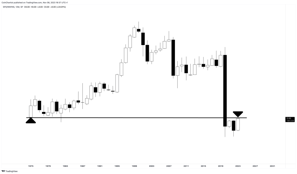
S&P 500 versus M1 Money Supply | SPX on TradingView.com
For comparison sake, this chart above is the S&P 500 against the same M1 money supply. Unlike BTC, which made a higher high since the massive money supply increases around COVID, the stock market has sunk to all-time lows against M1. This could be where Bitcoin’s restricted 21 million BTC supply comes into play. As the money supply increases, the supply of BTC tends to reduce, or at least stays the same.
All three charts originally appeared in Issue #26 of CoinChartist VIP, entitled “Not Bullish Enough”. Subscribe for free or upgrade to premium to view the full report. Access CoinChartist VIP for 20% off for a limited time with the Bull Market coupon code: Bullish

